CASE STUDY: Lylo
How ENC Built a Desert-Inspired Restaurant Brand Identity From the Ground Up
July 18, 2024

Client: Rise Hotel, Lylo and Don Woods
Industry: Hospitality/Food + Beverage
Service: a-la-carte — menu and signage design

A Journey of Visual and Culinary Transformation
Meet Lylo Swim Club, a place where culinary innovation meets seaside leisure in an atmosphere of relaxed sophistication. Nestled within the vibrant ambiance of Rise Uptown Hotel, Lylo Swim Club offers an enticing blend of coastal flavors and contemporary flair.
As Lylo Swim Club set out on their journey of reinvention, they sought a collaborative partner to breathe life into their fresh vision. That's where ENC stepped in. Together, we meticulously overhauled the color palette, offering insightful guidance and introducing vibrant new hues to illuminate their evolving perspective. This revitalization not only enhanced the visual allure but also echoed the culinary ethos of Lylo Swim Club—dynamic, lively, and inviting.
Simultaneously, as we reimagined the visual identity, the menu underwent a complete transformation. transitioning from Japanese-Hawaiian fusion to the exciting flavors of Sonoran cuisine, both taste and aesthetics experienced a remarkable ascent.

Desert-Inspired Illustrations with Culinary Delights
Illustrations are menu design's silent storytellers, offering a glimpse into the culinary adventure awaiting diners. they add depth, evoke emotions, and communicate the essence of dishes, enhancing the dining experience by enticing and engaging guests even before their first bite.
As Lylo embraced Sonoran cuisine, we found inspiration in the Sonoran landscape itself. Drawing from the hues of the desert, our color palette reflected the vibrant tones of the region, unveiling a menu that echoes the flavors of the land.

Putting Lylo and Don Woods Out in the Wild
Rise Hotel was set to venture into the summer event scene across the valley, requiring captivating marketing materials for their presence. The Rise Hotel experience promised a larger-than-life illustrated step-and-repeat moment and eye-catching table toppers.
Despite each cocktail bar boasting its own unique ambiance and aesthetic, maintaining cohesion for these materials was paramount. employing a consistent design across all materials ensured this unity, while leveraging individual brand color palettes and photography amplified each message distinctly.
What we love about a table tent moment? They are a formidable marketing tool—elevating brand visibility, sparking attendee engagement (in a non-invasive way), and igniting customer interest.
.jpg)

When the Step and Repeat Gets a Postcard Moment
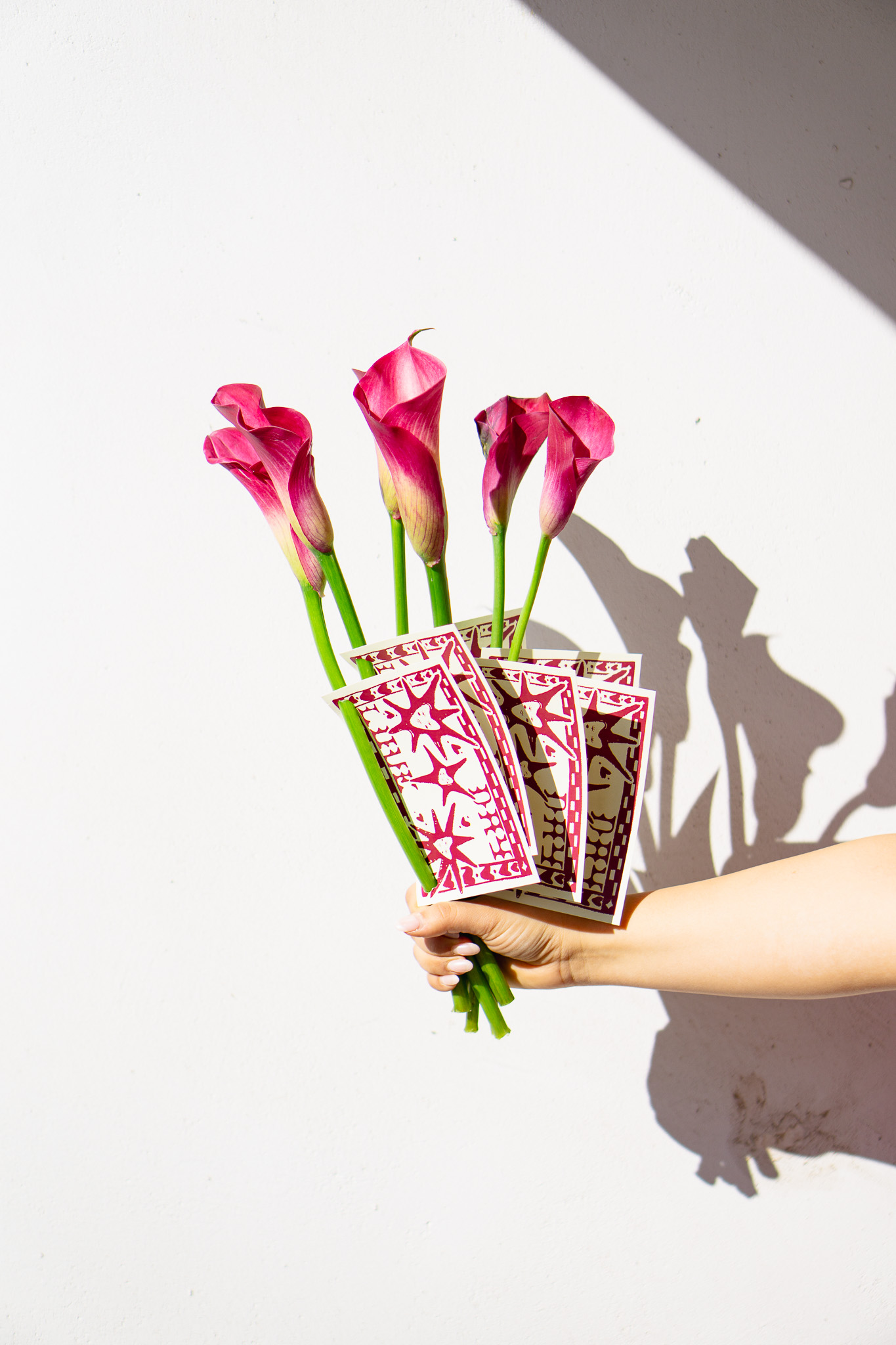
When we're creating, we like to give clients a few options to choose from. for this project, we had the step and repeat layout sorted, but we spent some time playing around with colors.
We debated whether to go with one color, full color, or a reversed look. Eventually, we let the client decide, and they went all out with the full-color version for the main banner. Later on, though, they came back and said they loved the other options too, and wanted them in both color schemes for things like in-room cards and mailers.
TLDR: one design multiple uses










.png)


