CASE STUDY: Portica
How ENC Created a Modern Brand Identity for a New Era Architecture Firm
September 5, 2024

Client: Portica
Industry: Architecture
Service: Ultimate Brand Bundle (ubb)

Empowering Architecture
In a traditionally male-dominated field, the rise of female architects is reshaping the landscape of the industry. One such architect, Kelsey Ahumada, envisioned her own path, driven by a passion for design excellence and a commitment to creating spaces that inspire and empower. With a desire to establish her own firm, her goal was to build a firm that not only reflected her expertise but also celebrated her unique perspective as a female architect.
She collaborated with our team to develop a distinct identity for her newly-founded architectural firm. from the initial stages of discovery and naming to the development of a comprehensive visual strategy, we worked closely with Ahumada to bring her vision to life. The result is a brand that embodies the intersection of innovation, elegance, and empowerment, positioning Ahumada's firm as an industry standard in the architectural landscape.

Where Classic Meets Contemporary
Inspired by classic architecture and the innovation of the bauhaus, the logo embodies the spirit of geometric abstraction, architectural innovation, and artistic experimentation, while incorporating the timeless elegance of arches to create a visually striking and memorable symbol.
The logo consists of a series of interconnected geometric shapes, primarily squares and circles, arranged in a balanced and harmonious composition. These shapes are stylized to represent various architectural elements, inspired by the clean lines and precise angles.
At the heart of the primary logo is an arch, spanning across the composition. This arch symbolizing both unity and progression, its smooth curvature contrasts with the rigid geometry of the surrounding shapes, adding a sense of fluidity and movement to the design.
Unexpected Environments
As a testament to the power of branding in shaping perceptions and fostering connections, Portica’s secondary logo demonstrates how a thoughtfully crafted brand can empower you to redefine boundaries, inspire communities, and leave a lasting legacy in the built environment.
Building on the Web
Developing Portica’s web presence provided an exciting opportunity to showcase her approach and personal narrative in an engaging manner. By leveraging innovative digital techniques, we were able to infuse her online presence with movement and depth, effectively bringing Portica to life.
Central to the web design strategy was the incorporation of Portica’s unique brand pattern. This pattern, inspired by the elegance of arches and how vision is manipulated by how you move around the arch, served as a visual motif that unified the user experience. From the homepage to service pages, this pattern provided a cohesive visual identity, reinforcing Portica's brand at every touchpoint.

Campaigns
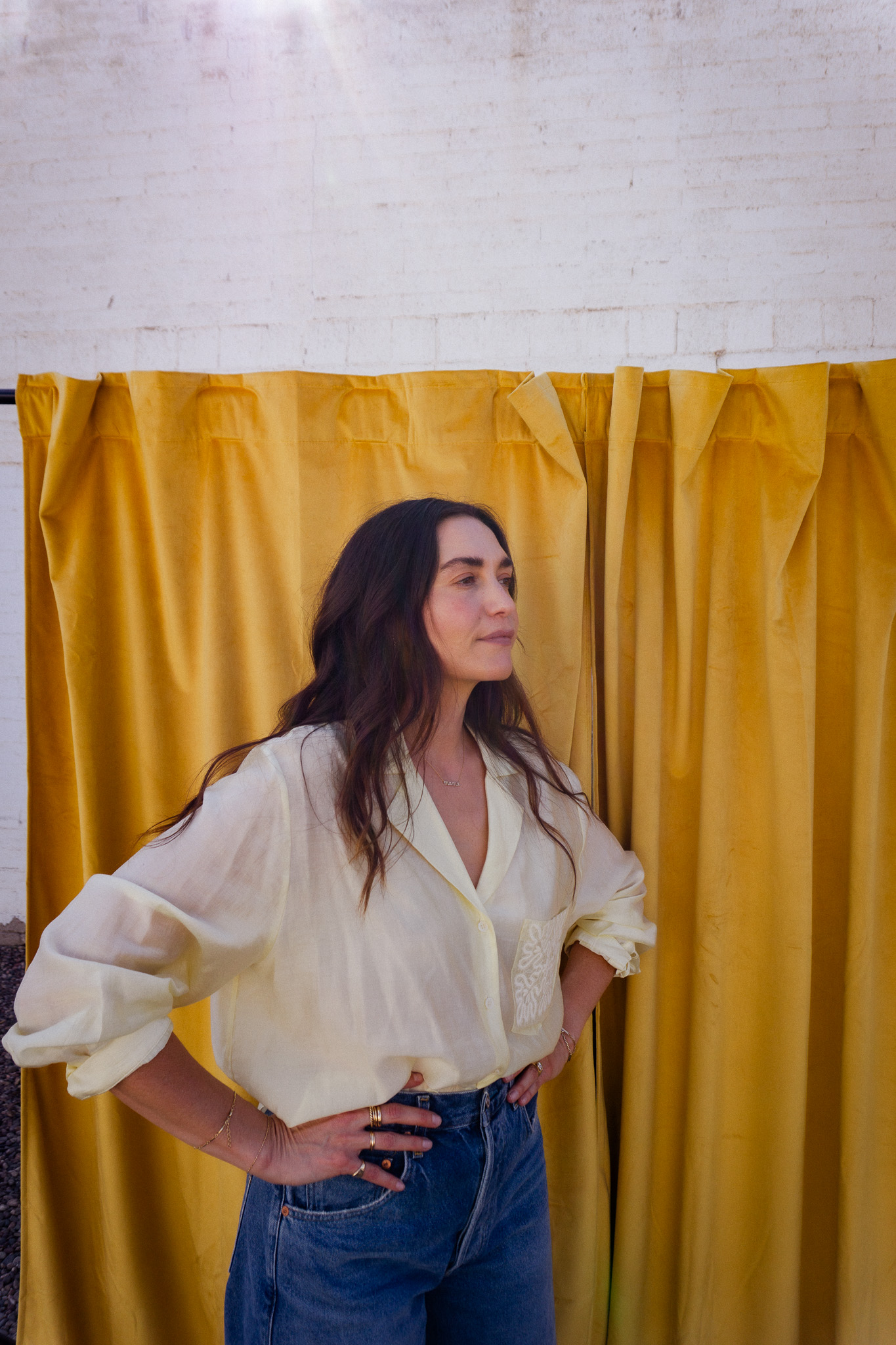
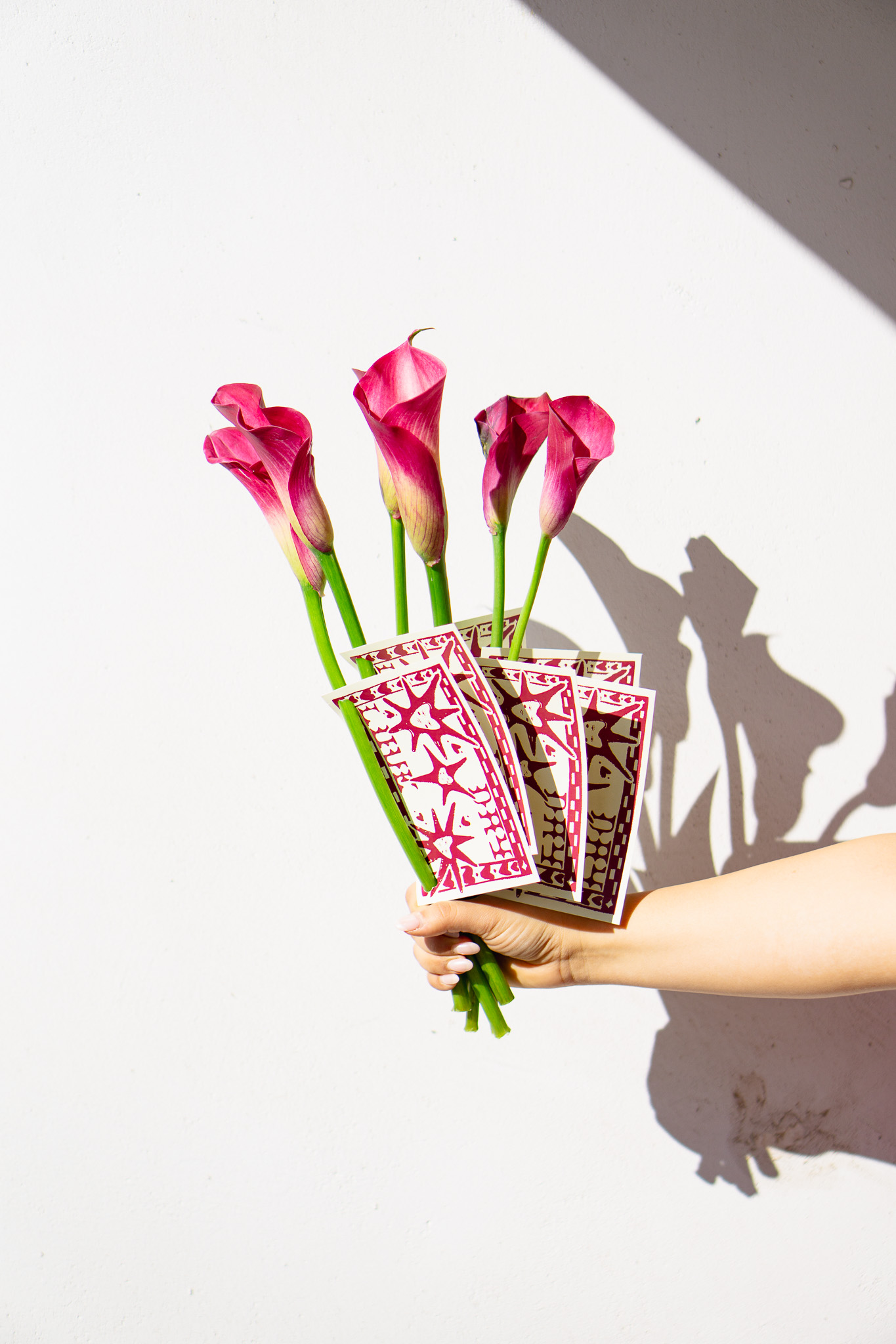
Photography and video always plays a pivotal role in bringing any brand to life, and Portica was no exception.
One of the key objectives of Portica's photography was to highlight the interplay between form and function. By capturing the play of light and shadow, the textures of materials, and the spatial relationships within each space, the photography brought a sense of depth and dimension to the scenes.

Digital Assets
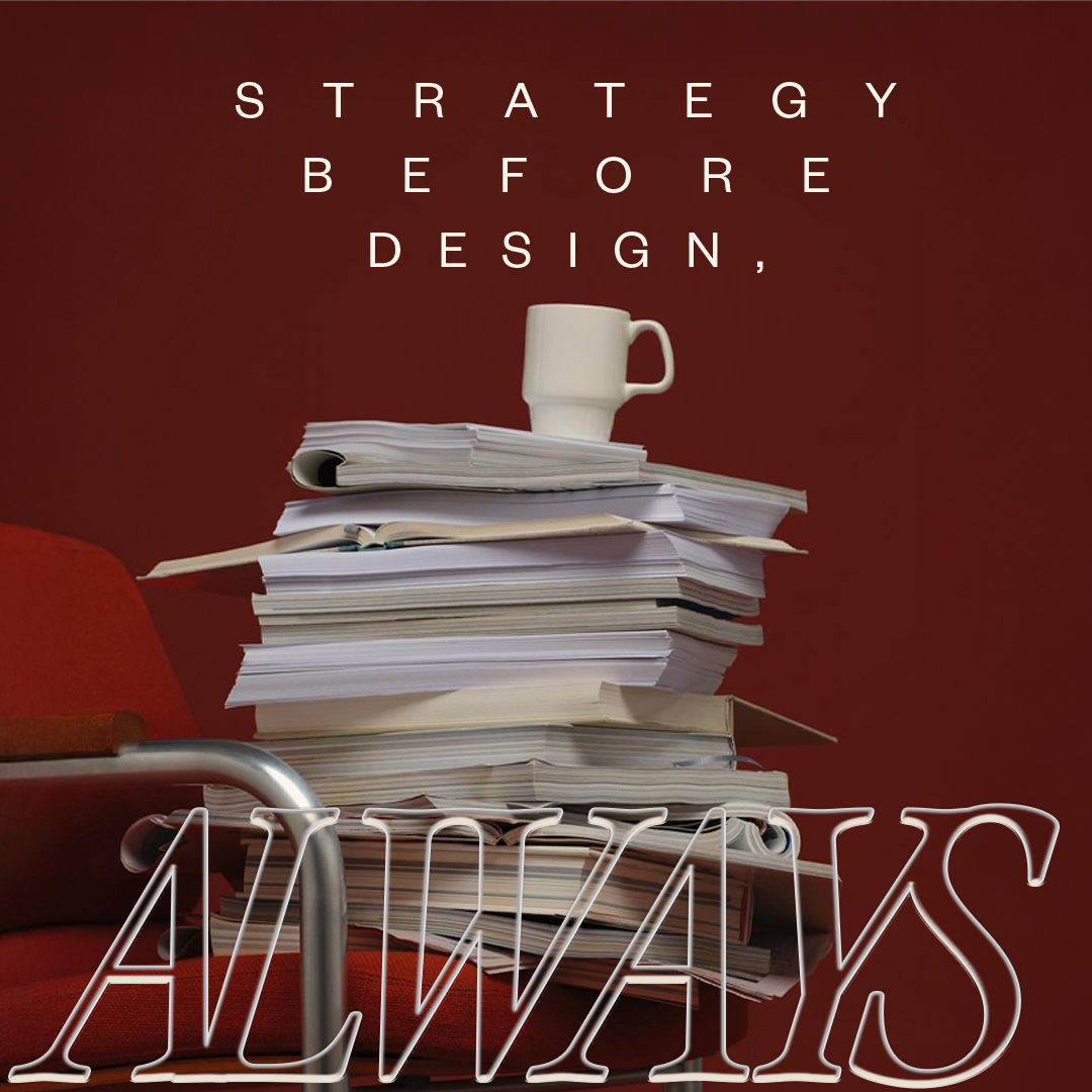
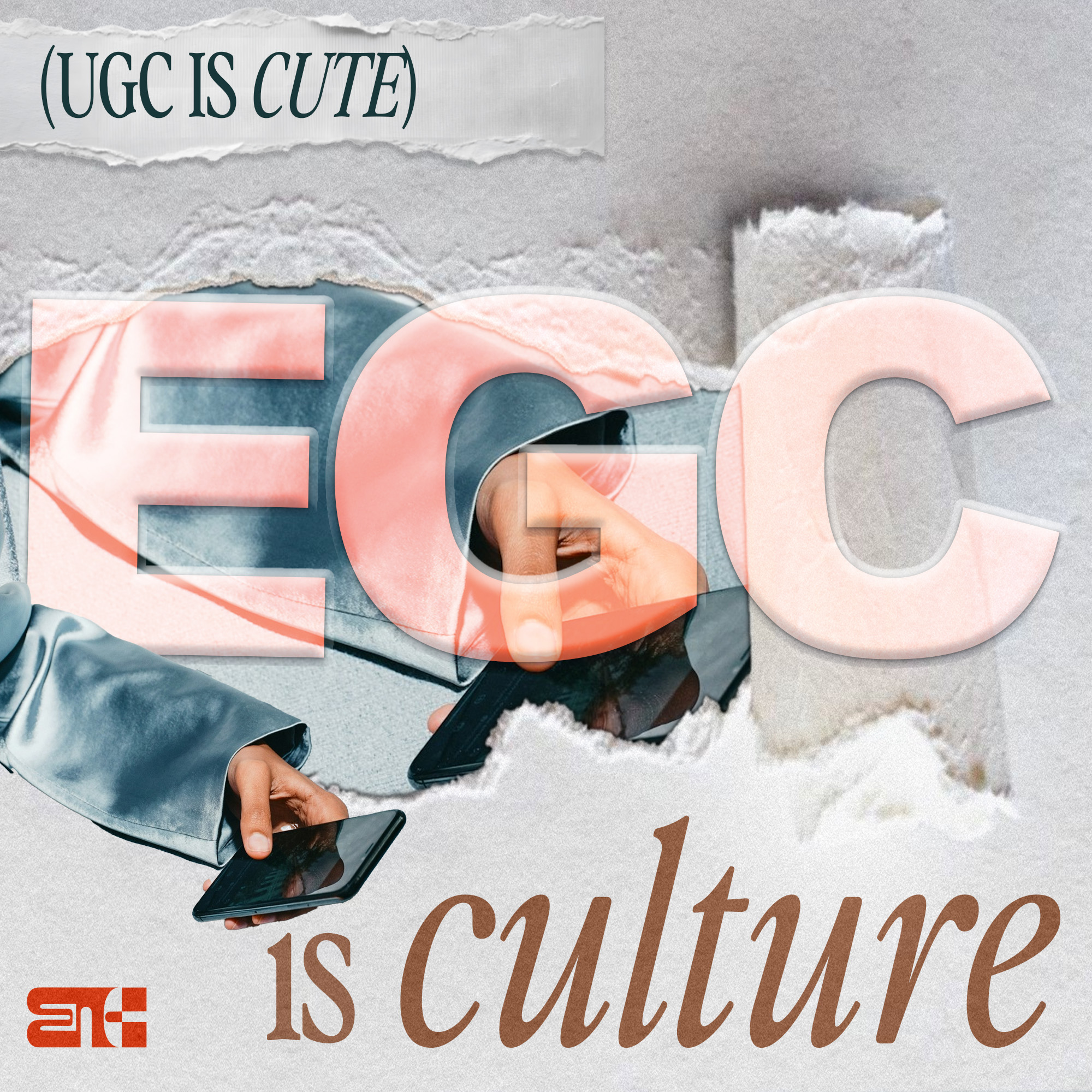
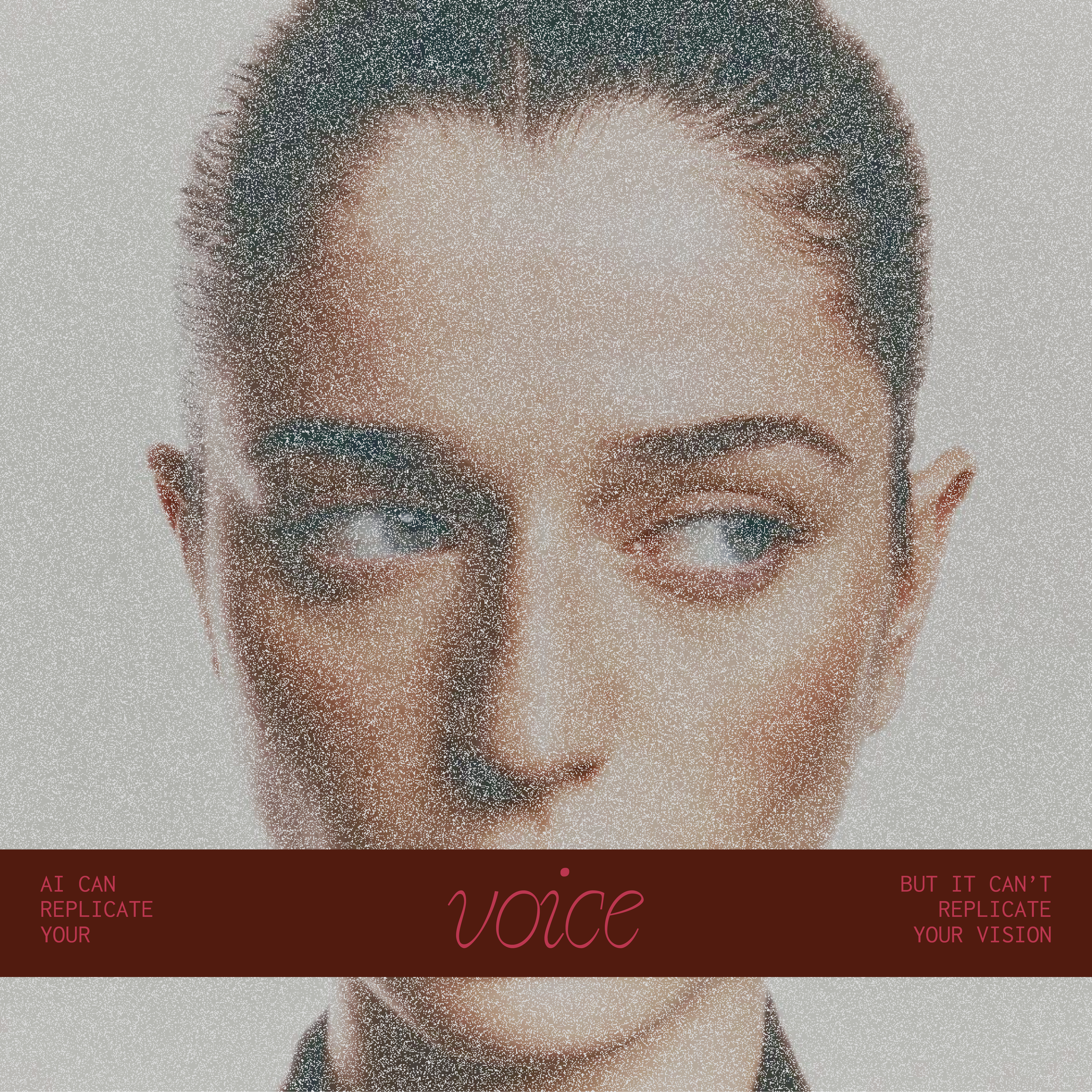
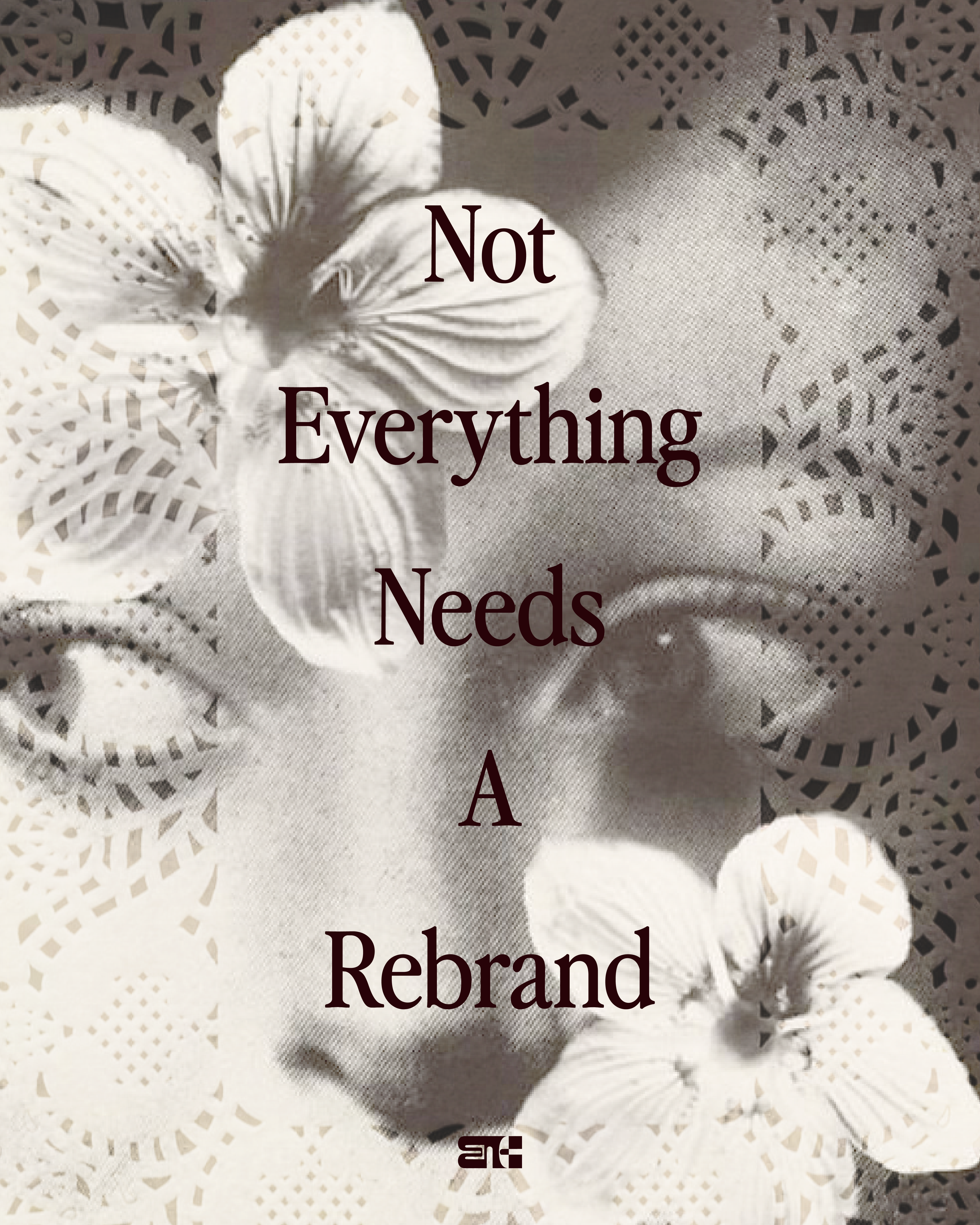
For brands looking to thrive in the digital age, social assets are one of the most indispensable tools in your tool belt. They are crucial for all brands as they streamline content creation, ensure consistency and elevate brand presence.
For Portica we provided 5 unique social templates that Ahumada can utilize as she begins to build trust, foster relationships and humanize Portica with her audience.















.png)


